Run Historical Reports
This is a procedural topic for supervisors and administrators describing how to run historical reports on a dashboard. All reports run and update for the selected time range to show historical data imported from historical data sources. Historical data is stored for a rolling 13-month period.
Prerequisites
- You have logged in to storm with your user log in credentials and then launched the VIEW application. See Log in to storm and Launch VIEW.
- A historical dashboard has been set up by an administrator. See Create a Dashboard for Historical Reports.
- You are familiar with the VIEW Dashboard Interface.
Procedure
-
For the dashboard of historical reports you wish to run, do one of the following depending on what is displayed:
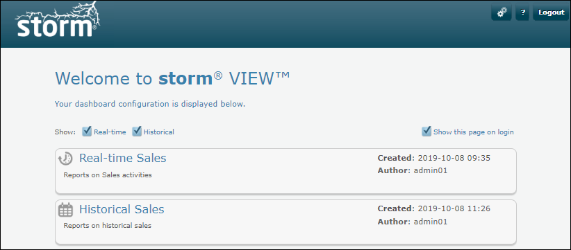
If you see the 'Welcome to storm VIEW' contents page, select the desired historical dashboard from the list. A ![]() icon identifies a historical dashboard.
icon identifies a historical dashboard.
If you see a screen of tabbed dashboards, click the desired historical tab:
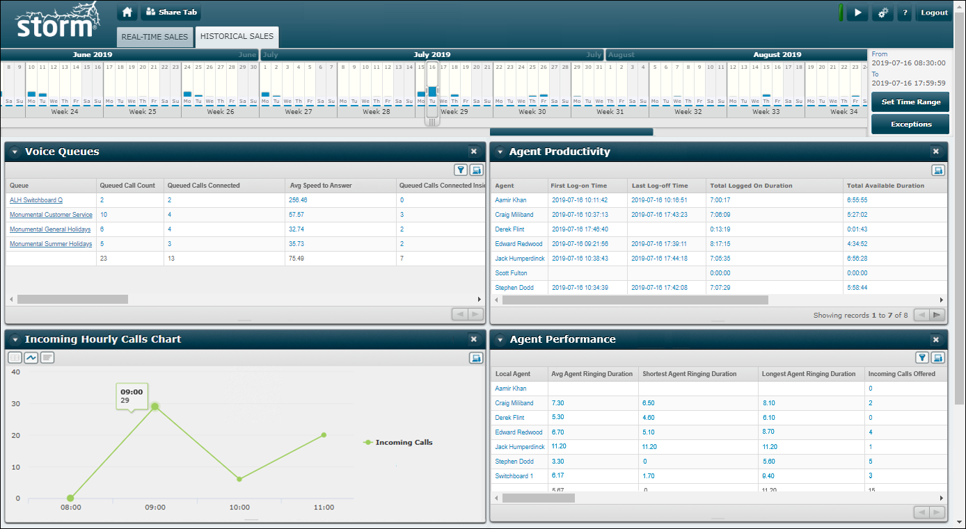
The report runs immediately to display data (if any) for yesterday between 00:00:00 and 23:59:59. This is indicated by the date selector on the calendar at the top of the window and the date and time on the right-hand side of the calendar.
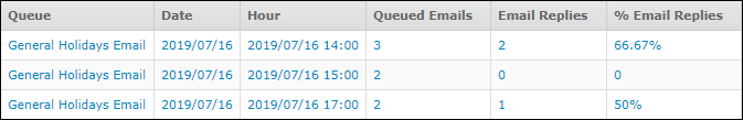
Hyperlinked values in the first column of a report mean that the report's metrics can be broken down to show more detail for each value.
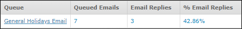
For example, in the illustration above, clicking the Queue value 'General Holidays Email' breaks down the three metric values by date as shown below. This indicates that, for the selected time range on the calendar, data was available for 2019/07/16. In this example, Queue is referred to as a dimension and, by clicking a queue value, you drill down by a dimensional level to the Date dimension.
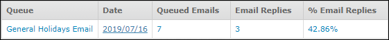
The date value is also hyperlinked indicating that a breakdown on the date is also available. Clicking this date breaks down the queue's three metric values by hour and shows that on 2019/07/16, data was available for the three hours shown.
Clicking the  button at the bottom of a report returns you to the previous dimensional level.
Note: a report with no hyperlinked items means either that the first column is the report's one and only dimension, or that the report is not broken down by a dimension at all.
-
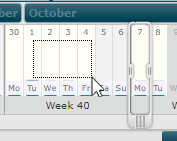
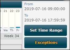
Do any of the following on the calendar to run the reports for other dates and times:
|
To see data for... |
Do this... |
|
Another day |
Click the calendar day. |
|
An entire week (Mon - Sun) |
Click the calendar week. |
|
An entire month |
Click the calendar month. |
|
Custom date range |
Click and drag one of the selector's handles to resize the selector over the desired date range. Alternatively, click and drag the mouse cursor to draw a rectangle across the desired date range.
|
|
Time range (within the selected date range) |
Click the Set Time Range button and then specify the time range in the displayed dialog. |
The report's data is updated automatically. You should allow between 6 and 10 minutes to see the latest historical data.
If data for a report is not displayed within a 100-second timeout, the following may be displayed in the report window:
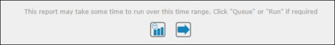
Click ![]() to re-run the report. If this still does not display any data, consider doing one of the following:
to re-run the report. If this still does not display any data, consider doing one of the following:
- Narrowing the selected date range.
- Clicking
 to run the report as a background task (queued report). See Run Historical Reports in the Background.
 - Simplifying the report such as splitting it into smaller reports (administrators only).
Note: if a report displays an error message instead of data, your storm administrator may have restricted you from seeing that report. See Effect of Access Profiles on Dashboard Statistics.
Note: to exclude time ranges from within the selected range, see Exclude Date and Time Ranges From the Reporting Period.
Explore Further
Display a Historical Report in a Graphical Format
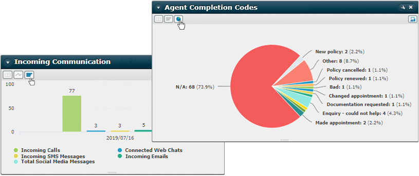
Some historical reports can be displayed in a selection of graphical formats. This depends on the design of the report and whether or not your report administrator has allowed the format. Click one of the display buttons below the title bar to display the report in that format. Shown below are the bar chart and pie chart formats:
|
Button |
Meaning |
Notes |
|
|
Bar chart |
Displays data as a set of vertical bars. Hover the cursor above a bar to display the value for that bar in a tooltip. Click an item on the colour key to toggle the display of the corresponding data. |
|
|
Pie chart |
Displays data as pie segments in a circle. Hover the cursor above a pie segment to display the value for that segment in a tooltip. Click a segment to highlight it. |
|
|
Line graph |
Displays data as a single line graph. Hover the cursor at a plot point to display the value for that point in a tooltip. Click an item on the colour key to toggle the display of the corresponding data. |
|
|
Grid view |
Displays data in the standard tabular format. |
|
|
Tree Grid view |
Displays data across any sub-organisations. |
|
|
Matrix |
Displays each value as a function of two variables (the variables are the header row and first column). |


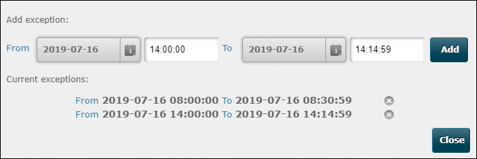
Exclude Date and Time Ranges From the Reporting Period
You can exclude one or more date and time ranges from the reporting period. This is useful if, for example, you wish to exclude uncharacteristic activity that skews your reports (such as missed calls during an emergency evacuation).
-
Click the Exceptions button on the right-hand side of the calendar.
-
In the dialog, define a date/time range to exclude and then click Add. The exception is listed. Add further exceptions as required.
-
Click Close. You are returned to the dashboard where the reports run automatically with the exceptions applied. The orange-highlighted button indicates that one or more exceptions are currently active.
Note: remember to remove exceptions when no longer needed by re-entering the dialog and clicking an exception's  button.
Understand Historical Reports
Run Historical Reports in the Background
Historical Data Sources (administrators)
Historical Data Export Reports (administrators)
Custom Historical Reports (administrators)
Historical Report Design (administrators)
Best Practice Guidelines
Appendix B: Best Practice Guidelines for Historical Report Performance