Accessibility and Responsiveness
Compliance with Web Content Accessibility Guidelines (WCAG) v2.1 means that DTA provides both mouse and keyboard-driven navigation along with a high contrast colour scheme and screen reader support. Very large text sizes and high zoom settings in your browser are also supported.
Its responsive behaviour causes user interface elements to adapt their layout to the size of the application window and the zoom level.
Accessibility Features
Keyboard Navigation
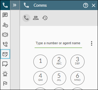
DTA version 2 is fully keyboard driven. Use the keyboard Tab key to navigate forwards to visible controls such as buttons and fields. The control that is in focus is shown with a blue border as illustrated below. Pressing the keyboard Enter key on an in-focus control activates the control as if clicked with a mouse.
Use the Shift + Tab key to navigate backwards through controls.

Your storm administrator may have assigned keyboard shortcut keys for common call-handling functions (such as for call hold, cold transfer, warm transfer, and disconnect call) and for changing availability statuses.
Note: keyboard shortcuts are currently available only if you are using a storm-registered deskphone or a PSTN device.
Contrast Ratio
A minimum contrast ratio of 3:1 is maintained between adjacent user interface elements.

Availability Status
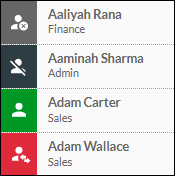
User availability status is conveyed using both colours and symbols.

Screen Readers
DTA is equipped to work with screen reader accessibility tools (such as NVDA) allowing blind or vision impaired users to navigate to main areas of the screen with ease.
Responsive Behaviour
You can use DTA at zoom levels of up to 400% and very large text sizes with no loss of information and function. This is subject to a display area effective pixel width of 320 pixels at a 100% zoom level and a browser window width of 1280 actual pixels (four times the minimum effective pixel width of 320). Text zoom of up to 200% is also supported.
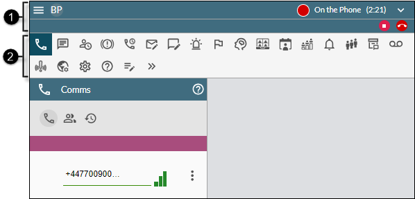
If there is no longer enough available space to display all information in the standard display mode, the layout changes automatically to a more compact mode as illustrated below:

|
|
|
|
|
|
|
|
Title bar |
This is a reduced height title bar with no storm logo. The Call-Handling panel is moved to the far right below the status indicator. Your name, which appears in the Availability Status panel at lower zoom levels, is now replaced by your initials on the left side. A new |
|
|
|
Toolbar |
This now appears horizontally directly below the title bar. The button for displaying the Interactions Panel |
In addition, the text on some buttons is replaced by a symbol.
Note: the images of the DTA interface in this Help are as seen at the lower zoom levels of below 200%.

 button allows you to toggle the display of the Toolbar.